
Image Design Brief: Plan a Pottery Workshop Poster
Build an image design brief for a pottery workshop poster, then compare layouts and record the effort needed to correct text and composition.
What's new on this page
- 2026-10-29 — Page published. Clarified the guide’s search focus, added a practical FAQ and replaced the embedded video with an image.
A useful image design brief makes the poster’s audience, visual hierarchy and exact copy explicit before you create. This pottery workshop example turns those decisions into a small comparison you can review without mistaking a suggested prompt for a tested result.
A small, repeatable design brief makes image drafts easier to evaluate. Ask for one product, one message, and a clear area for information you will edit later. The exercise below uses a fictional pottery workshop to separate composition, wording, and revision effort through a reusable review method.
Image design brief: define the job for the image
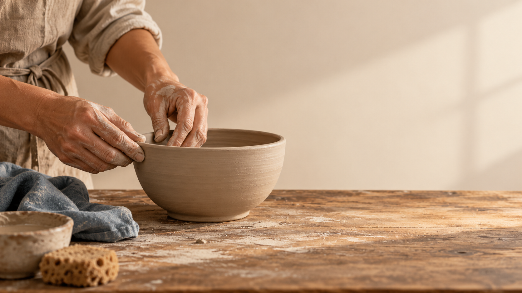
For our exercise, the offer is a beginner pottery session called “Shape Your Saturday.” The audience needs to recognize a creative activity and find the event details. We will use a clay bowl, working hands, and a calm workbench as the image brief. Dates, booking links, and venue details should remain editable because they can change after the artwork is chosen.
Prepare a brief you can reuse
Before opening a generator, write a short acceptance sheet. It should describe the result you need, not a collection of flattering adjectives.
-
Requirement: One unfinished bowl on a workbench; Why it matters for this exercise: Identifies the activity without competing products
-
Requirement: Hands shaping the rim; Why it matters for this exercise: Makes the workshop feel participatory
-
Requirement: A broad quiet area at the right; Why it matters for this exercise: Leaves a planned location for event information
-
Requirement: Warm clay, cream, and muted blue; Why it matters for this exercise: Provides a restrained palette for later text styling
-
Requirement: No visible logos or fabricated writing; Why it matters for this exercise: Keeps the concept usable with your own approved details
Choose a final placement before testing. A square post and a tall story have different space requirements. For this first exercise, use a square composition. A later format adaptation is a separate question; do not change shape halfway through a comparison and attribute every difference to the prompt.
Start with artwork that leaves room for copy
Use this original suggested prompt:
Square promotional artwork for a fictional beginner pottery workshop. On the left half, a close view of two adult hands shaping the rim of one unfinished clay bowl on a wooden workbench. Soft side light, warm clay, cream, and a small muted-blue cloth. Keep the right half calm and mostly empty for editable event details to be added later. The bowl should be fully visible. No text, lettering, logos, extra hands, or additional pottery pieces.
The prompt makes the information area part of the composition. When reviewing a candidate, draw an imaginary rectangle over the right half. Could your event details fit there without covering a hand or the bowl? If not, the empty-space requirement has failed even if the photograph-like styling looks impressive.
Inspect the hands and rim independently. At ordinary viewing size, look for fused fingers, an interrupted edge, or an object that is hard to identify. These are review questions, not predictions that the model will make those errors. Keep notes attached to each candidate rather than relying on memory.
Run a second experiment for the headline
Keep the same subject and layout, then replace the final instruction with:
Place the exact headline “Shape Your Saturday” in the upper-right area using simple dark-blue lettering. Keep clear space below it for event details. Include no other words, numbers, logos, or decorative letters.
This isolates one question: does generated lettering help this particular design? Check the headline against the original string, including every word. Then shrink the image to the size at which someone will see the post. If the phrase only works when enlarged, it has not met the communication task.
The artwork-only version is a useful control. You may prefer it if dates, languages, or wording will change often. Generating text inside an image and having a text element you can edit are different outcomes. Inspect the actual editing workflow before committing to a campaign that depends on frequent changes.
Record correction effort, not just preference
Use the following log for each candidate:
-
Check: Main subject; Record an observation: Is the bowl identifiable and fully visible?; Next action: Adjust framing if needed
-
Check: Space for information; Record an observation: What overlaps the intended copy area?; Next action: Simplify the nearby composition
-
Check: Wording; Record an observation: Which letters or words differ from the brief?; Next action: Correct in an editor or try the artwork-only approach
-
Check: Small-size readability; Record an observation: What becomes unclear in a small preview?; Next action: Reduce detail or revise the hierarchy
-
Check: Revision effort; Record an observation: Which changes still require manual work?; Next action: Decide whether another generation would help
This log produces a practical comparison without inventing a universal quality score. If you test another model, use the same brief, placement, and review conditions. Record the model shown in each interface. A different product name on a website is not evidence that the same underlying model was used.
Keep the experiment small and the cost visible
Review the account's current access and usage notice before starting. Choose a small number of trials you can afford and stop when you have enough evidence to select a workflow. Repeated generations without a new question make the experiment harder to interpret.
On AIJev, the image generator provides a separate place to explore a visual brief with the models actually offered there. Check its selected mode and current settings. If you are considering AIJev usage, consult the pricing page alongside the generation interface.
Your deliverable from this exercise is a decision: generated lettering, artwork with editable copy, or a brief that needs revision. Keep the accepted image, exact prompt, and correction log together. That record is more useful for the next workshop announcement than a vague memory that one version looked better.
Frequently asked questions
What belongs in an image design brief for a workshop poster?
Name the audience and destination, list the exact event copy, then describe the subject, layout and visual priorities. Review each draft against those decisions rather than judging appearance alone.